I spotted this yesterday but was on the way out of the office so didn’t get a chance to chronicle the change.
We know that Google experiments with the way its advertising looks and feels as this is a critical part of Google as a business. Don’t forget that currently, over 90% of all its revenue comes from online advertising and Adwords is the key driver of that revenue.
Changes to Adwords formats therefore then to be quite frequent but usually quite subtle as a radical change, the sort that could dramatically impact on revenues, is quite unlikely.
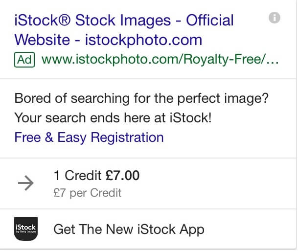
The change which it has just introduced is on desktop and mobile advertising and looks like this;

 As you can see, the mobile version which is shown first is quite a leap forward from the early days of ads on phones, but with the transformation of the mobile environment and the fact that more of us now search on mobiles, this makes perfect sense. The desktop version is, by comparison, quite boring.
The thing that strikes us though is that the green ‘Ad’ tag is very subtle. In fact, it is so subtle that the people we tested this with though that they were just normal listings.
Google is always criticised when the advertising looks like natural listings as they get accused of driving profits at the expense of user satisfaction. We will soon see if this change, therefore, is here to stay.


